GIS has transformed how Sociologists do demographic studies
Click on any of the maps below to see the Map Gallery
Geographical Information Systems (GIS) technology has merged the measurement of time and distance with U.S Census data. Time and distance are fundamental causal factors in Sociology. Contemporary GIS techniques can measure the demographics of areas associated with time such as drive time minutes and can measure demographics in any irregularly shaped geographical area.
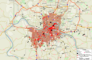
GIS units are not words, or numbers, but map layers and the layers can be swapped in and out of any given map. For example, a layer of nursing homes and a layer of hospitals can be added to the same map and the distances from each nursing home to each hospital can be measured. In the Northeast states such studies usually show the average distance from a nursing home to a hospital is about ten miles. Nursing homes that are closer to multiple hospitals have a strong competitive advantage in obtaining patients.
Another example of measurements across layers are network adequacy studies which require precise measurement among points in different layers such as the distances among types of health care providers and managed care beneficiaries.
This map gallery contains seven kinds of maps:
-
-
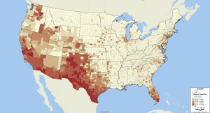
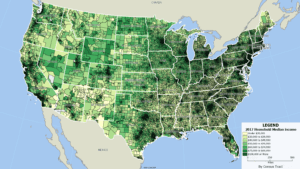
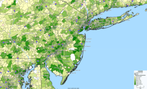
- Basic maps on standard geographical layers such as census tracts, zip codes or counties;
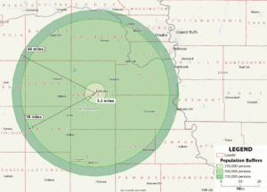
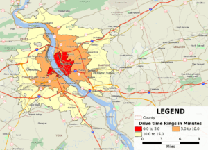
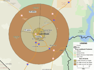
- Concentric circle analyses where the distance is given and the population is solved for;
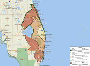
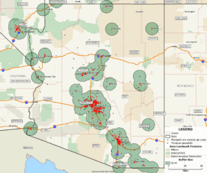
- Buffer analyses where the population is given and the geographical area containing the population is solved for;
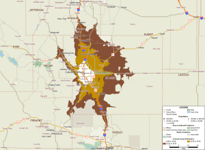
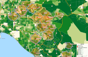
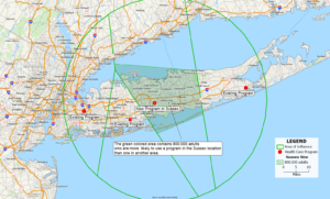
- “Area of influence” analyses where a new program/business is placed in the middle of existing businesses and the population that lives closest to the new business is solved for. This is a powerful and little-known technique that identifies the size of the population closest to the new business. Once you know the size of this population you can make estimates as to how many are likely to use the new business;
- Network adequacy studies where the spatial distance between medical providers and insurance beneficiaries is examined. Hendrickson Development routinely provides tables showing the time and distance between provider locations and beneficiary addresses;
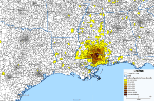
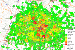
- Zip code analyses showing where a business or program’s users come from, and
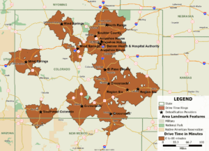
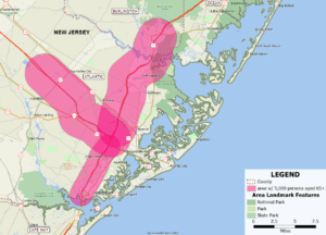
- Geo-fencing studies where irregularly-shaped hand-drawn map areas are created and the census demographics in the customized area are estimated.
-
Click on any of the maps below to see a full screen version of it and a capsule description. Use the arrows on each side of a map to see previous and next maps. Clicking on the map will return you to this page. When you are on the screens with the large maps, all maps are PNG files and can be copied into Word, Excel or other programs.
Map Gallery
